Observation-Elevator
- 2017年9月26日
- 讀畢需時 1 分鐘
I would like to talk about one very common interactive technology which is used in our daily life, the elevator. Although elevator already had 163 years history, the design of different elevator is still the key to decide how it interact or worked with people.
The elevator is normally used on the tall building which floors are exceeding than 6. People press the button when they wait for the elevator out side, and press the botton of the floor when they are inside the elevator.

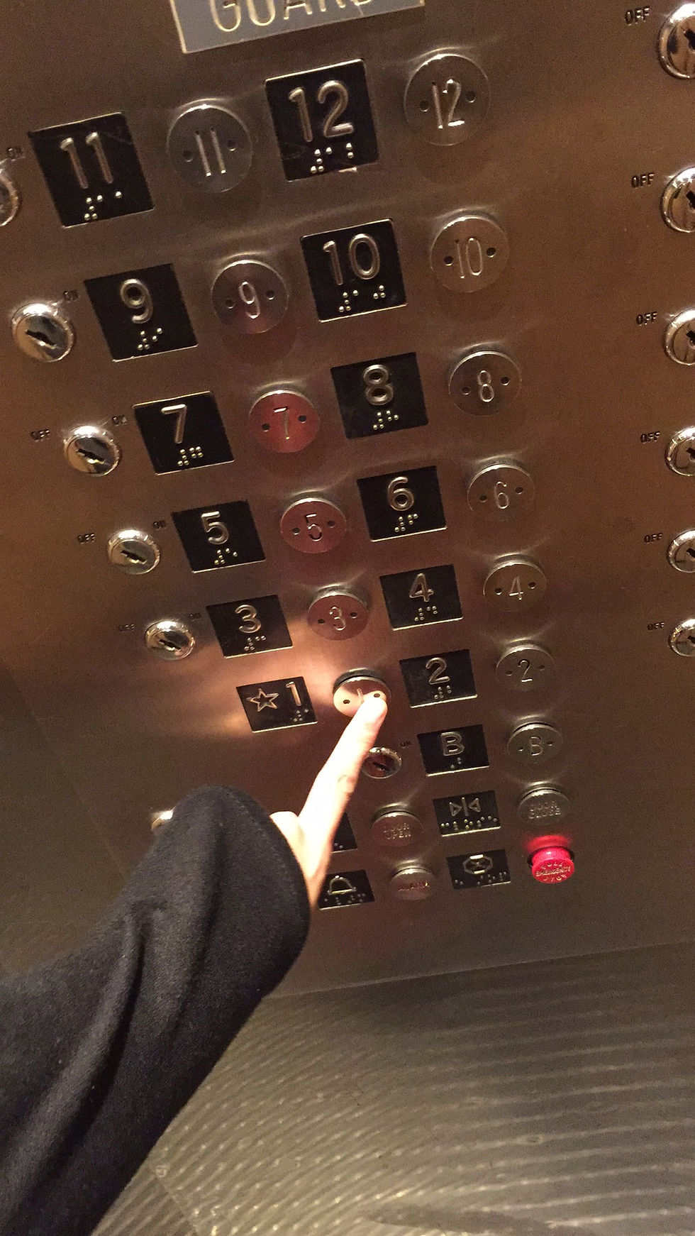
But sometimes, if the indication or indicated light is not very clear, people will kind of worry about if they can get to their floor rightly. Such as the elevator in Tisch Building. I've seen so many times people press the same button for several times, since there is no clear indication to show that the chosen floor has been chose. Or look around the elevator, try to find the clear indications. So some time people are panic about the function of the elevator. And also there is no screen to show the elevator is up or down. So some people may take more time to get to their floor.

And the interface of the interactive part is also not that perfect. When people press the botton, it dones't have the feeling to really press it. The texture of the button makes the experience unsitisfied.
It's also another reason make people to press it more times to confirm they indeed pressed it.
In general, although already has long history, but how to make it interact with people better, still need more consideration when we design it.


留言